By Gary Chan
Pros:
- Finding POI’s was nice and simple
- Setting and customization of personal preferences
- Ability to make changes to settings via steering wheel mounted buttons
Cons:
- Lag while system processes voice command
- 8-inch touch screen not very touch sensitive
- Entering navigation destinations by voice or touch … ugh!
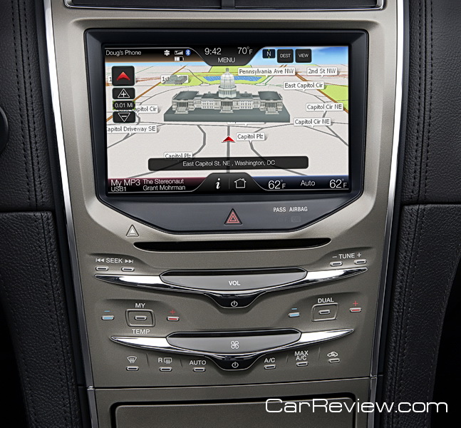
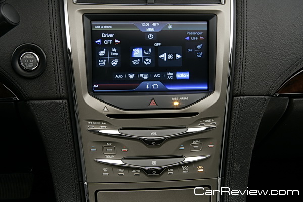
What do an 8” LCD touch screen on the center stack, two customizable LCD screens, media integration and connectivity (USB, RCA video), and the ability to turn the vehicle into a local area network for your passengers using a wireless USB modem all have in common? They are all components of MyLincoln Touch technology.
Based upon the new MyFord Touch technology unveiled last year, MyLincoln Touch is now available on the 2011 Lincoln MKX and will become standard equipment across the Lincoln lineup. We recently received an MKX for testing and I decided to put the MyLincoln Touch technology to the test to see if it really did enhance my driving experience. Integrated voice control of music, phone, climate, and navigation in a luxury SUV — it doesn’t get much better than this, or does it?

User Experience
Navigation functionality with the MyLincoln Touch system was a love/hate experience. I tried following the voice prompts to enter a new destination, and it couldn’t understand the street name despite several tries (and this was while the car was not running so ambient noise was minimal). I even had my neighbor say some street names, and the system found streets that were close (in spelling), but incorrect. Sometimes, I was able to successfully enter the city and street address without issue, but it was far less than the failed attempts.
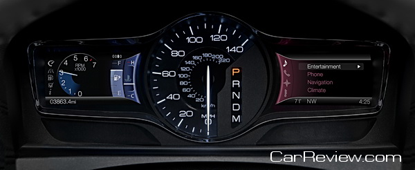
Finding points of interest (POI) like Target, Starbucks or Peet’s Coffee was far easier to accomplish, enabling me to search, find, and start navigation to my destination. The processing time after speaking a command was on the long side; it’s typically a second or two, but sometimes longer (i.e., when searching for a POI). One neat feature was having abbreviated navigational instructions replicated on the right cluster screen in the instrument panel.
The entertainment, climate and phone functionality provided a much better experience than navigation. After downloading my phone book to the MKX, I could easily dial by name: “Call John Smith”. If I had several numbers for a particular contact, the system prompted me for which one (like cell or work) I wanted to dial. Changing the temperature or fan speed was very easy using a voice command (or the steering wheel mounted buttons); there’s also a touch sensitive bar on the center stack that you can slide your finger across to adjust fan speed (a similar bar exists for volume). Once in the Radio voice menu, you can say “AM 810” or “FM 101.3” to change to a specific radio station, and the same ease of selection applied to satellite radio.
The two cluster screens in the instrument panel proved to be very helpful. The right cluster screen displayed entertainment, navigation/compass, or climate info/settings, while the left cluster displayed trip information, fuel economy, vehicle settings, vehicle information, and system check info/settings. Each was controlled by a direction toggle switch with center OK button.
The benefit of this setup is that I could see the information that I wanted, or make changes to settings, without removing my hands from the steering wheel or looking at the larger 8-inch LCD on the center stack. Making inputs on the 8-inch screen unfortunately requires a firm touch. I wish it was a bit more sensitive because I often had to take my eyes off the road to make sure I was pressing the correct location (which I was), before pressing again more firmly.


Pingback: wordpress